Roughly 3.5 million Google searches happen each day. With stats like this, it’s not unlikely that the average person might see the Google logo anywhere from one to 30 times per day.
Throughout the past two decades, the Google logo has been iconic and easy to recognize. And across all of its evolutions, it has stayed misleadingly simple.
Google Logo History
1996: The First Google Logo
The search engine’s very first logo actually predates the name “Google.” Larry Page and Sergey Brin originally called their web crawler “BackRub.” Brin and Page chose this name because the engine’s main function was to search through the internet’s backlinks.

Luckily, by 1997 they’d changed the company’s name to the much less creepy “Google” — a misspelling of “googol” — a Latin term that literally means 10 to the 100th power (written out, that’s one followed by 100 zeros). The idea behind the name was that Google’s search engine could quickly provide users with large quantities, or googols, of results.
1998: First (real) Google logo
Some sources credit Page with the creation of the first Google logo, while others say Brin designed it with a free image editor called GIMP. Whomever it was, their design wasn’t exactly the most polished.
1999-2010: Ruth Kedar’s logo designs
A mutual friend introduced Brin and Page to Stanford assistant professor Ruth Kedar. Because they weren’t in love with their logo, they asked Kedar if she’d design a few prototypes.
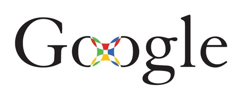
She started with a mostly black logo using the Adobe Garamond typeface. She also removed the exclamation point that was in the original logo.
Page and Brin like this logo because the mark in the middle looked like a Chinese finger trap, Kedar says.

The graphic designer’s next attempt used the Catull typeface (which should look familiar). The logo was meant to evoke accuracy, like a target.
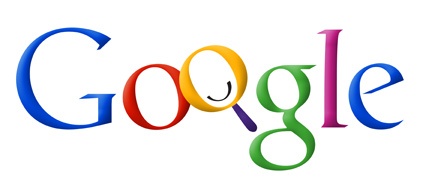
Then Kedar got a bit more playful, experimenting with color and interlocking Os. Those Os ended up becoming the basis for the Os at the bottom of every search engine results page.
Between the crosshairs and the magnifying glass, Brin and Page thought this design was a little visually overwhelming.
The next few iterations appear more like the Google logo we know and love today. These designs feel younger and less serious than their precedents.

Kedar makes the letters pop off the page with shadowing and thicker lines.
The eighth design was the simplest yet. Ultimately, Kedar wanted to show Google’s potential to become more than just a search engine (hence the removal of the magnifying glass). She also changed the traditional order of the primary colors to reemphasize how untraditional Google was.
This version’s colors and the slanted angling make it feel youthful and energetic.

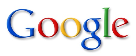
The final design is one of the most minimal. It was Google’s official logo from 1999 to 2010.
On May 6, 2010, Google updated its logo, changing the “o” from yellow to orange and removing the drop shadowing.
2015: A new logo for Google
In 2015, designers from across Google met in New York City for a week-long design sprint aimed at producing a new logo and branding.
Following the sprint, Google’s logo changed dramatically. The company preserved its distinctive blue-red-orange-blue-green-red pattern, but changed the typeface from Catull to the custom schoolbook-inspired Product Sans.
At the same time, Google also rolled out several variations on its logo, including the rainbow “G” that represents the smartphone app and the favicon for Google websites, and a microphone for voice search.

The new logo might look simple, but the transformation was significant. Catull — the former typeface — has serifs, the small lines that embellish the main vertical and horizontal strokes of some letters. Serif typefaces are less versatile than their sans-serif typefaces since letters vary in weight.
 Product Sans is a sans-serif typeface. That means it’s easy for Google’s designers to manipulate and adapt the logo for different sizes — say, the face of an Android watch or the screen of your desktop computer. As Google’s product line becomes more and more diverse, an adaptable design becomes essential.
The logo is also meant to look young, fun, and unthreatening (read: “I’m not like other massive tech corporations, I’m a cool massive tech corporation.”) This was a prescient move — since Google unveiled this design in 2015, concerns about data privacy have reached a fever pitch.
A Dynamic Logo
Google’s logo is also now dynamic. When you begin a voice search on your phone or tablet, you’ll see the Google dots bouncing in anticipation of your query.
As you speak, those dots transform into an equalizer that responds to your voice. And once you’ve finished talking, the equalizer morphs back into dots that ripple as Google finds your results.
“A full range of expressions were developed including listening, thinking, replying, incomprehension, and confirmation,” explained a Google design team blog post. While their movements might seem spontaneous, their motion is rooted in consistent paths and timing, with the dots moving along geometric arcs and following a standard set of snappy easing curves.
Implementation and Growth of the Google Doodle
In 1998, Google started playing with the Google Doodle — a temporary modification of the traditional Google logo.
The first Google Doodle originated in 1998 — before the company was technically even a company. Page and Sergey were attending the Burning Man festival. As a kind of “out of office” message, they put a stick figure drawing behind the logo’s second O.
As the years progressed, so did the detail of the featured doodles.
In 2000, Brin and Sergey asked then-intern Dennis Hwang to come up with a doodle for Bastille Day. Users loved it so much that they appointed Dennis “chief doodler.”
Today, doodles are often used to commemorate holidays, special occasions, and birthdays of scientists, thinkers, artists, and other important people.
The first Doodles tended to mark well-known holidays, like Valentine’s Day, Halloween, and Indian Holi (in India). But as time has gone on, they’ve become more and more global and creative. For example, on September 1, 2017, this Doodle celebrated the first day of school (or mourned it, depending on who you ask.)
To decide which events, figures, or topics get doodles, a team gets together periodically to brainstorm. Doodle ideas can also come from Google users. After an idea or doodle pitch gets the green light, the actual doodles are designed by illustrators and engineers.
Google reported in 2015 that they’d launched more than 2,000 doodles for various homepages around the world. While Google hasn’t shared more recent stats on its doodles, PRI noted that they’d climbed over 4,000 by 2016.
Google has continued to embrace doodles with a verified Twitter account devoted to updating its audience about newly-published doodles. The account has over 127,000 followers.
Google also invites people to submit ideas for doodles at proposals@google.com.
There’s more than meets the eye to Google’s logo. As people and technology evolve, the design has too. At the rate things are changing, we’ll probably see a new version in a few years.
Article by Aja Frost
Contact Steel Blue Media Today! Call Us at (715) 821-9482
Website Design & Development | Graphic Design | SEO | Social Media Marketing | Copywriting | Branding | Marketing
[contact-form][contact-field label=”Name” type=”name” required=”true” /][contact-field label=”Email” type=”email” required=”true” /][contact-field label=”Website” type=”url” /][contact-field label=”Message” type=”textarea” /][/contact-form]

